How to Make Sense of Science in the Media

The need to understand science in the news has never been more important. Much of it is conflicting and confusing, and it can feel overwhelming to mentally process. So, how can we try to understand the science, spot information that is poor quality or misleading and decide what to trust? Realistically, we can’t all be scientific experts, but we can talk to one. We asked esteemed science communicator Dr Alexis Willett for her advice on how to get our heads around scientific information.
Dr Willett recommends we ask ten main questions to help pick out the good data from the bad. Although we’re unlikely to ask all of these every time, it’s useful to think about the why, what and how, also the who, where, when and what comes. For a short read, here are the 10 questions you can ask. For a longer read from Dr Willett, read on past the questions.
1. Why does this particular piece of scientific information exist? What is its real purpose? (Is it objective?)
2. What type of study led to the data and how was it carried out? (Is the data credible?)
3. What type of information is being presented? (Does the data support the claims being made?)
4. Are any limitations in the information acknowledged? (Is the data certain?)
5. Who produced/published/is promoting/funded the information? (And are they biased?)
6. Are others talking about this information? (Or does it go against the grain?)
7. Where did the data originate? (From a trustworthy source?)
8. Where was this information published or presented? (Has it been checked?)
9. When was the data published or presented? (Is it thorough?)
10. Does the information set out what should come next? (And why?)
For more detail on what to look out for from Dr Willett, read on:
WHY?
Why does this particular piece of scientific information exist? What is its real purpose?
- Is the aim of the information clear? For instance, is it to better understand what’s happening in a particular population, to find a solution to a problem or to inform a policy position? Does the aim make sense and is it meaningful? If not, what do you feel the real purpose behind it is? Perhaps it is simply to push a particular narrative (e.g., propaganda), an individual’s personal profile, an organisation or a product, rather than objectively provide meaningful information. There may be hidden objectives.
WHAT AND HOW?
What type of study led to the data and how was it carried out?
- We should consider whether the data is credible and to what extent it means something to us. For example, has is come from a clinical trial involving people or a laboratory study involving animals or cells? Was it from a survey of the general public or a focus group of experts?
- How many research participants were studied? Size is important – in general, smaller samples produce less reliable results.
- How relevant are the results to the people or situation you are interested in? If the study was in mice, are the results relevant to people? If the study was on diesel engines, are the results relevant to solar energy?
What type of information is being presented?
- For example, is it hard data that you might see in a research paper, or is it other people’s interpretation of data that you might find in a media article or blog? Hard data is better but is more difficult for your average person to comprehend. An interpretation of the data helps us by picking out the key points and presenting them within a broader context, but it risks being interpreted incorrectly or in a biased manner (e.g., the interpreter may put a deliberate spin on the data).
- When looking at graphs, it’s normal for your eye to be drawn to the pattern or shape of the data, e.g., a line going up or down or a cluster of points. But graphs can be misleading. Take a look at the axes – what do they represent and do they make sense? Are the intervals between points even? Are similar things being compared or is it a case of apples and oranges, i.e., they are different things entirely? Is there a real pattern in the data or could someone have artificially placed a line on top of the data points to imply a trend when there isn’t really one? Is there an explanation accompanying the graph? If not, could someone else have taken it out of context? Does the data really support the claims being made? Could there be other interpretations?
Are any limitations in the information acknowledged?
- If there are possible issues with the data, such as how it was produced or how other interpretations are possible, are these discussed? Are other people discussing any concerns about this evidence or similar issues? This helps us to understand whether the information is certain or not.
WHO?
Who produced/published/is promoting/funded the information?
- Are they from a reputable and credible institute or organization? Is the publication reputable and credible? Not all scientific journals or media sources are equal! Do those involved wish to present objective data or an impassioned viewpoint? What narrative might they be hoping to present? For instance, a government may wish to present only particular aspects of data that support its course of action, or a company may want to highlight the benefits of its product without releasing information about its negative points.
- Who funded the study, or who has funded the researcher or institute previously, or who funded the publication of the report, or who funds the spokesperson? Think about what motives the funders might have and whether there are potential conflicts of interest. In other words, who may be seeking to benefit?
Are others talking about this information?
- What are others saying about the issue and the latest data? How do the opinions match up? For example, if this information contradicts all other sources and opinions on the issue, is it a genuine breakthrough or could it be an unhelpful or misleading outlier? If it is very different to the bulk of similar information, consider why this might be and why it is being promoted.
- Don’t forget to be critical of yourself – are you really being impartial when interpreting the science or are you picking out data that suits your point of view?
WHERE AND WHEN?
Where did the data originate?
- Could there be biases due to where the data is from? ‘Where’ could mean the country, institution, field of study, or even individuals. Consider the level of expertise, credibility and reputation. Do they have a good track record in the area?
Where was this information published or presented?
- Has the information been through any form of review process? Do others in the field support it? Does the publisher or promoter have a good reputation in this area? Could they be letting through poor quality work to fill their publication, or selecting works that only show one side, or only the controversial aspects, of an issue? This is certainly relevant when the scientific information is being presented in the media.
When was the data published or presented?
- Is the work new or is it a retelling of older information? Might it have been rushed out early to coincide with a trending issue or announcement, so may not be complete or thorough?
WHAT NEXT?
Does the information set out what should come next?
- For instance, a research article might state what the next stage in the research process should be, or a government report might set out what its next steps in taking action on an issue might be. Does it take us closer to understanding, or making progress in tackling, the issue? Does it make clear what needs to happen next or enable people to take action? Good scientific information should help us to better understand a situation and indicate how we can move forward in some way.
So, we shouldn’t always take scientific information at face value. There are many ways to tell a tale but we have to be careful not to let a good story get in the way of hard facts. We won’t always know what the truth really is, but next time you come across scientific information, perhaps ask some of the questions here and see if they make you think differently about what is being presented to you.
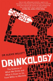
Dr Alexis Willett is a science communicator and author of Drinkology: The Science of What We Drink and What It Does to Us, from Milks to Martinis and How Much Brain Do We Really Need? (with Jennifer Barnett). She also runs online training in science communication and how to use evidence at www.tangelohousetraining.com
SHORTLISTED FOR THE 2019 ANDRÉ SIMON FOOD & DRINK BOOK AWARDS
'Like a new Bill Bryson, she offers an easy sharing of deep knowledge, with humour, where one learns things in a gentle way without it feeling like learning.' Dan Jago, judge of the André Simon Food & Drink Book Awards
'Hot or cold, caffeinated, alcoholic, sweet or not, this book provides a fascinating cultural history of our favourite drinks, and explores the science (or not) underpinning their many health claims. A wonderful read!'
Dr Giles Yeo, author of Gene Eating
'A truly engaging read. By dispelling common health misconceptions and debunking bad science, Drinkology arms us with information to make better choices about what we drink, not just what we eat.'
Ian Marber
'Very engaging and entertaining . . . a clear guide to everything we need to know about drinks, from water to milk, tea, alcohol and beyond. Dr Willett dispels common myths and fads and sets the record straight . . . allowing us to make fully informed choices. A fascinating deep dive into the science behind everything we drink.'
Elisabeth Cresta and Caroline Day, founders of Fight the Fads
Do you really know what you are drinking? Are you sure? We all consume many drinks every day, often without thinking. Perhaps we're just thirsty, perhaps we need something to wake us up, perhaps we need something to relax us at the end of the day. But have you ever stopped to wonder what exactly is in that chai latte you're guzzling or just what those added electrolytes in your bottled water are supposed to do?
Whether it's a simple glass of water or early morning espresso, the finest champagne or energy drink the morning after, all drinks have an impact on our body in one way or another. Drinkology distils the scientific evidence to see if we can get to the bottom of questions, such as:
Is a regular glass of wine good for our health or not?
Should we worry about energy drinks?
Is fluoride in our tap water harmful?
How do non-dairy milks compare with each other?
What's the secret to the perfect cup of tea?
Are fermented drinks and probiotics the answer to all our worries?
Is there such a thing as a 'superdrink'?
Whether you want to discover the true benefits of wellness drinks, find out if sulphites in wine really cause headaches, or are just sick of the pseudoscience behind the marketing of what we consume, this book is for you. Drinkology is a scientific digest of many of the world's most popular beverages and may just change the way you drink.